RETURNS SYSTEM REDESIGN

Removing assumptions:
Accountability in a returns process

Redesigning a fragmented set of tools and a broken returns process to reclaim time and properly account for the money and product of a $3 Billion company.
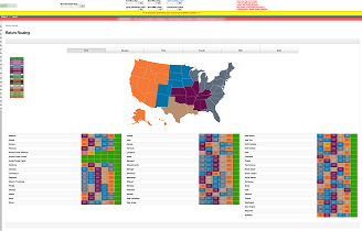
The new routing map with new accessible color palette.
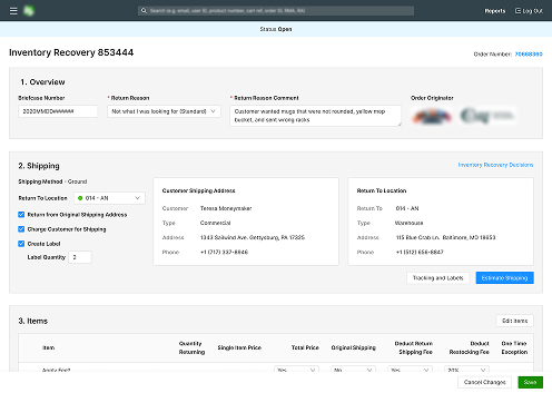
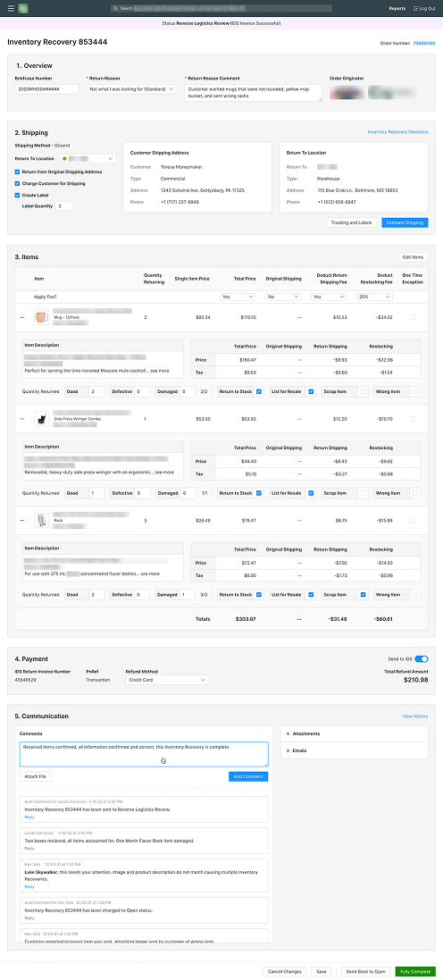
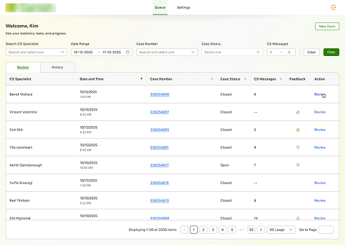
The new main returns management page.
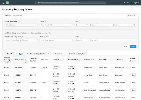
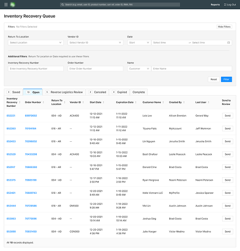
The new queue for warehouse employees to process returns.
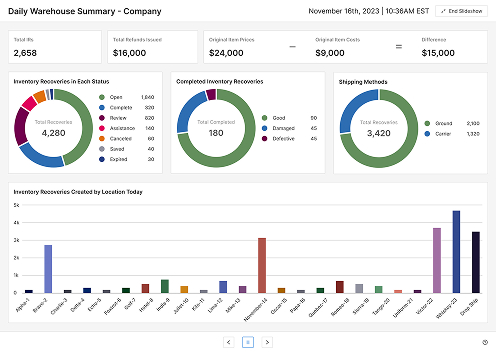
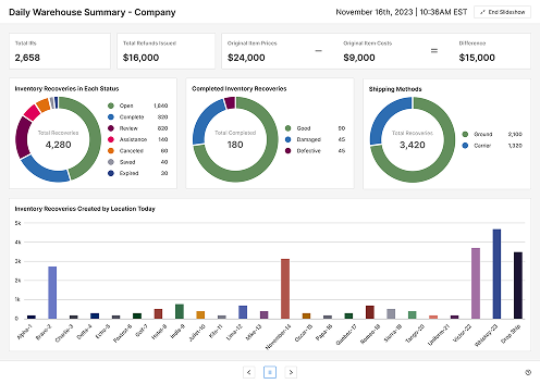
A slide from the warehouse summary statistics using the same warehouse color palette.
ROLE
Product Designer
Team
1 Designer (Me!)
2 Administrators
4 Developers
2 QA Engineers
Timeline
~ 2 years
Scope
3 New Tools
4 Redesigned Tools
Summary
The company's returns process technically worked, but it was not a coherent system. Creating, tracking, receiving, refunding, and completing returns was accomplished across multiple disconnected tools, spreadsheets, emails, and workarounds. There was no reliable source of truth, no clear tracking process, and no accountability when things went wrong.

I was brought in as the sole Product Designer to fix that. Over the course of nearly two years, I worked with a product owner, business analyst, four developers, and two QA engineers to design a suite of seven interconnected tools that consolidated the entire returns lifecycle into one accountable system.

The result: roughly 6 to 8 hours saved per employee per week, an estimated 1 million dollars recouped from previously lost or mishandled returns, a measurable reduction in operational errors, an accessible color system that outlasted the project and was adopted across additional internal tools, and a single streamlined system to handle it all.
Recouped an estimated monthly
$1 million
Saved each returns warehouse employee an average of
6 - 8 hours weekly
Eliminated jumbled workflows across
7 tools → 1
Problem
The existing returns process's most obvious flaw was that it was a collection of tools, not a system.

Employees could technically create and process a return — but there was no reliable way to see where it was in the process, which team owned it at any given moment, or where a mistake had occurred. Work was spread across 5 separate tools, patched together with spreadsheets, emails, and informal handoffs.

The consequences weren't abstract. Returns got lost. Inventory records became unreliable. Taxes and shipping costs were sometimes calculated incorrectly. And when something went wrong, there was no trail to follow — just a blame game between teams with no way to prove what had actually happened.

For a $3 billion company processing returns at scale, this was an expensive problem.
Old Routing Decisions Map
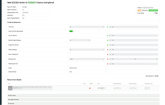
Confusing Main Returns Page
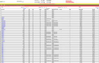
Original Returns Queue
Understanding the process
The Product Owner was the domain expert. They knew the returns process inside and out, and had strong opinions about how things should work. What they didn't have was a vision for how things could work.
I used their documentation as a starting point, but I didn't treat the existing process as inevitable. I worked through the systems myself, asked detailed questions, and gathered feedback from the people actually doing the work.

Despite what you may think, asking users directly created friction early on. Many of my suggestions were initially pushed back on. But I learned quickly that describing a better workflow wasn't enough. Once I could show a working prototype or flow, the value became much harder to dismiss. Most of those early rejections eventually became part of the final product.

The core design challenge was separating necessary complexity — business rules, edge cases, and operational realities that genuinely required nuance — from accidental complexity that only existed because the tools had never talked to each other.
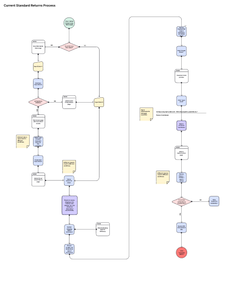
User flow of original returns process
Designing under real constraints
This was not a greenfield product. Every design decision had to work within real operational constraints:
Large datasets — Some searches required specific filters before results could load because the underlying data was too large to query broadly. The UI had to make that constraint feel intentional, not broken.

Shared warehouse workstations — Some steps had to be completed on shared computers in the receiving warehouse. The experience needed to support fast, repeated use in a loud, busy environment, not an ideal personal workstation and a quiet desk.

Large-format displays — Maps and statistics needed to work on monitors hung on warehouse walls, visible from a distance, readable at a glance.
Legacy integrations — The new React application still had to interface with older inventory and order management systems. Some dependencies couldn't be replaced.

Migration in progress — Parts of the process were moving from ColdFusion to React while other pieces stayed behind. Design had to account for that seam.

Accessibility from scratch — The previous tools had no meaningful accessibility consideration. Color choices, hierarchy, interaction patterns, and text sizing all needed to work across interfaces, maps, charts, and warehouse displays simultaneously.
The solution
Rather than rebuilding each tool in isolation, I designed them as a connected system so that every employee involved in a return could see what had happened, what needed to happen next, and easily determine who was responsible for it.
1. The Inventory Recovery (IR) Page — the source of truth
The IR Page is where a return is created, processed, and resolved. It handles shipping calculations, tax logic, item-level tracking, return states, customer communications, attachments, and notes — all in one place.

The central design challenge was information density. A single return could contain multiple items following different paths, at different stages, with different refund and restocking outcomes. Showing everything at once was overwhelming. Hiding it was dangerous.

The solution was a collapsible table structure — the return-level summary stayed always visible, while item-level detail could be expanded when needed. Employees could work at the right level of detail for their role without losing the overall picture. The expandable sections contained inputs and checkboxes for specific teams as well, so that the returned items would be routed to their proper destinations.
2. The Returns Queue — ownership made visible
The Queue is the warehouse worker's home base. It shows every return at a given warehouse, where it is in the process, and who has claimed it.

The most important question it answered wasn't "what is the status of this return?" , it was "what needs to happen next, and who is responsible for making it happen?"

Each tab in the table is color-coded to correspond with what status the return is currently. Links to the Inventory Recovery Page and the original order help keep things flowing easily. Also included is the last user to open and modify the Inventory Recovery Page for each return. An action button to send it to the next status helps move things along quickly for some of the more surface-level steps.

The Queue also gave the newly formed reverse-logistics monitoring team a way to see the full picture across all active returns and intervene when something stalled.
3. The Decisions Map — logistics planning with an accessible color system

The Decisions Map is where the logistics piece is managed, which warehouse a return routes to based on where it's coming from, including international orders.

The design challenge here was the color system. The previous implementation used color codes that were inaccessible and inconsistent.

The new system needed colors that were:
• Distinguishable across warehouse regions and specific locations
• Readable on interface elements, charts, maps, and large warehouse displays simultaneously
• Accessible to users with color vision deficiencies
• Scalable as new warehouse locations were added

There were 6 general regions to assign color codes to with almost 30 warehouses and more added to the list over the coming months that I was working on this. We used plugins and tools such as a colorblind simulator, and a contrast checker to make sure that even the shades in the same hue family would show enough difference to be easily differentiated.

The final palette was harder to arrive at than expected but it was later adopted in additional internal products beyond the returns system ensuring that all the warehouses were assigned a specific accessible color.
The supporting tools
The IR Page, Queue, and Map were the some of the more system-intensive centerpieces, but the system also included:
Warehouse Statistics Slideshow — large-format performance dashboards designed for warehouse monitors, showing returns, inventory, and logistics metrics at a glance with accessible sizing and color
Comprehensive Search — with a compounded, expandable filtering system to handle large dataset constraints
Vendor Address Directory — an address book for outside vendors covering shipping and logistics details, which also served as a permissions hub for the reverse-logistics team
Wrong Item Reporting Page — an extensive logic tree in a drawer with its own queue to make sure that every wrong item reported was accounted for to the best of our ability and all edge cases were covered.
Results
Formal product analytics were limited, so impact estimates draw from workflow analysis, user feedback, and the removal of recurring manual tasks. The results of my efforts included:
6 - 8 hours saved per employee per week across the reverse-logistics team
More than a million dollars recouped monthly from returns that previously fell through the cracks and inefficient processes
Eliminated the accountability gap — every return now has a named owner at each step, ending the blame game when errors occurred
Redesigned 5 tools and added 2 new tools into one connected environment housed in the same space to modernize the entire process
Accessible color system adopted across additional internal products after the returns project shipped
$1 million
estimated value recouped monthly after redesign.
6 - 8 hours
saved on average per employee per week across the returns team.
7 tools → 1
cohesive system to keep everything in one place.
WCAG AA
accessible color palette for use across all internal tools and warehouses
Accountability
for every step of the returns process eliminating the blame game for mistakes
What I learned
The most important thing this project taught me was the difference between explaining a better solution and showing one.

The Product Owner was deeply expert in how returns worked, but that expertise sometimes made it harder, not easier, to imagine how the process could be different. Early in the project, many of my suggestions were pushed back on. Later, most of them shipped. The turning point wasn't better explanations or ideas, it was better prototypes. Once stakeholders could experience an improved flow rather than just hear about it, the resistance dropped.

If I did this again, I'd move into system-level prototyping earlier and spend less time trying to describe what I could build for people to react to instead.