AI-Assisted Quality Assurance

Getting a real picture:
QA process tooling for full statistics

Designing an AI-Assisted customer service quality assurance review system that consolidated a severely tedious 5 tool workflow and boosted output exponentially.
ROLE
Product Designer
Team
1 Designer (Me!)
2 Administrators
4 Developers
2 QA Engineers
Timeline
9 months
Scope
V1: Chat reviews with AI-
assisted form completion
Summary
The company's customer service QA team was responsible for reviewing every CS rep once a month, but the process of doing that review required navigating five separate tools, manually hunting for average-length interactions across disconnected databases, downloading files to re-upload them elsewhere, and assembling feedback emails with custom summaries for every rep they evaluated.

The result was a process so time-consuming that meaningful QA coverage was impossible to achieve. A single review cycle for one rep took an average of 60–75 minutes, most of which was spent on tool-switching and manual file handling rather than actual quality assessment.

I designed a unified, AI-assisted review environment that consolidated the entire workflow into one place. The AI handles the mechanical assessment work. The human handles the judgment calls. V1 designs covering chat-based reviews were at handoff stage when I departed the company.

The result: an estimated 4–5x increase in review capacity that moved the QA team from monthly spot-checks toward genuine continuous performance monitoring.
Increased review capacity an estimated
4 - 5x
Set up the MVP and future versions for seamless
AI incorporation
Streamlined the workflow from across
5 systems → 1
Problem
The customer service quality assurance team had a process to tedious that it was impossible to truly get enough information to know how the customer service team was actually performing.

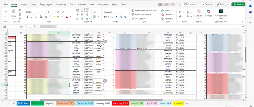
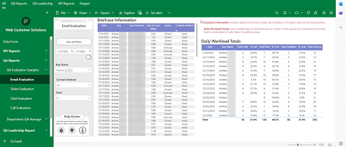
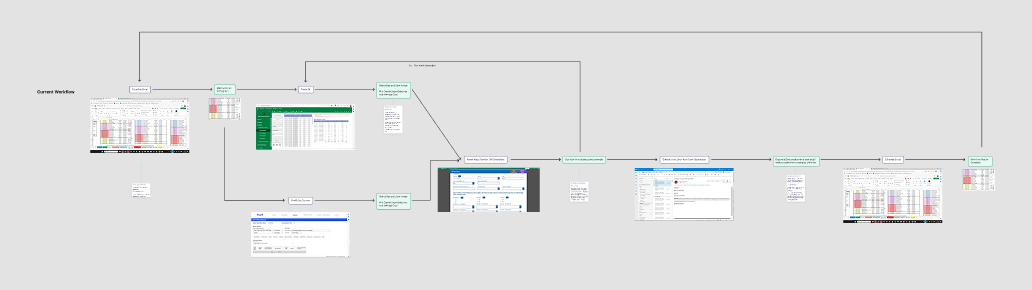
From a schedule in an Excel sheet updated for each week and month, to looking up agents in a PowerBI app to gather some averages and number relevant to their customer interactions, to the three separate places those interactions were housed, to the clunky and confusing PowerApp form to rate each interaction example pulled, to then downloading the examples and uploading them for a link, to pulling in the automatic emails sent by every submitted form into another outlook email where all the submission results and sharepoint interaction example links were attached and finally sent to the customer service rep.

It was such a convoluted process that each agent was reviewed each month using only 4 examples, one of each kind and an extra of the interaction type they completed the most of. Add to this the minimum requirements that were not always met as chats, calls, and case email chains needed to be a certain length to qualify and the internal case needed to be closed and completed to be reviewed, and you have a recipe for extreme inefficiency.

The result was that depending on the ease of access the review process often took an hour or often two hours per rep, most of it spend navigating tools and not evaluating performance.
The excel file schedule for QA reps.
PowerBI application for pulling some examples to review.
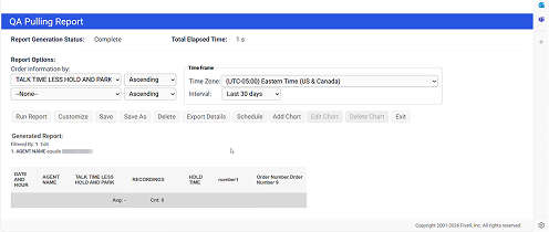
Third party tool for storing and pulling phone call examples.
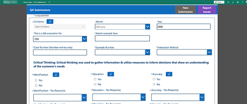
Old review form with separate dropdowns for "Yes" and "No" reasons.
Understanding the process
Before designing anything, I spent time observing the QA team's actual workflow end to end, which is the same approach I took on the Returns project. Understanding why the process worked the way it did, including the workarounds that had become necessary, was essential to designing something the team would actually love.
User flow of original review process.
Some things were immediately clear. The Excel scheduling spreadsheet was load-bearing and a real hindrance. It was the only place anyone could see who was reviewing whom and whether reviews were on track. Any replacement had to account for that function, not just eliminate the tool. The Power Apps form was universally disliked but the underlying rubric it enforced was genuinely well thought out. The problem wasn't the evaluation, it was everything surrounding it. The most time-consuming parts of the process came from pulling examples and crafting emails, and had nothing to do with quality assessment. They were pure overhead that the tools imposed.

That framing shaped the entire design direction: keep the rubric, eliminate the overhead, and let the AI handle what it's good at so the human can focus on what only a human can do.
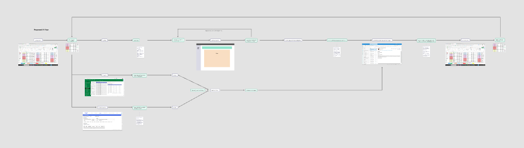
User flow of V1 MVP process doing chats only and not incorporating the schedule or email services.
User flow of ideal final review process completely housed in the singular tool.
Designing under real constraints
This was not a greenfield product. Every design decision had to work within real operational constraints:
Reviewer skepticism about AI — Asking QA agents to trust AI assessments of their colleagues' performance was a significant UX challenge. The design had to make the AI's role transparent and the human's authority unambiguous. Every AI suggestion had to be clearly framed as a suggestion, not a decision.

Rubric complexity — The evaluation rubric covered Critical Thinking, Professionalism, and Resolution across multiple sub-criteria, each with Yes/No responses and conditional dropdown options. The form logic was non-trivial and had to remain fully intact while becoming significantly faster to complete.

Closed case requirement — Interactions could only be reviewed if the associated case was closed and met minimum length thresholds. The filtering system had to enforce these requirements without making them feel like obstacles.
Multi-type interactions — Chats, phone calls, and emails each had different sources, different formats, and different qualifying criteria. V1 focused on chats, but the architecture had to account for all three from the start so that adding types later wouldn't require rebuilding the foundation.

AI training specificity — The AI needed to learn the company's specific QA standards, not generic customer service benchmarks. The feedback loop built into the design, where reviewers could flag incorrect AI assessments, was as much a training mechanism as a UX feature.

New database and custom structure — Since this was a new consolidated tool and all of the interactions needed to be housed or referenced here with the ability to bring in example links and transcripts, the database developers had a lot of restrictions for the design of the tables and filters.
The solution
What was clearly needed was a single place to house everything but since we needed to be agile and walk up small wins, the V1 MVP simply was meant to handle a table of the chats, the new form, and the first stage of AI integration which on release would reliably be able to fill in 4 yes/no radios and choose the appropriate reasoning for those fields in the select input.

To avoid a massive amount of work later, I also drew up the beginning layouts and functions of how it might work when housing all of the different interaction types and the schedule as well as messaging between the QA team and the customer service reps.
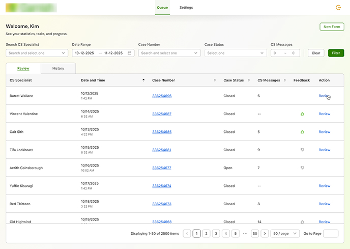
The review queue
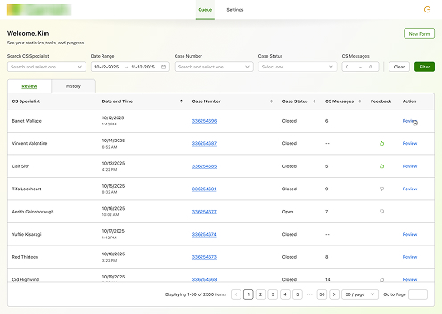
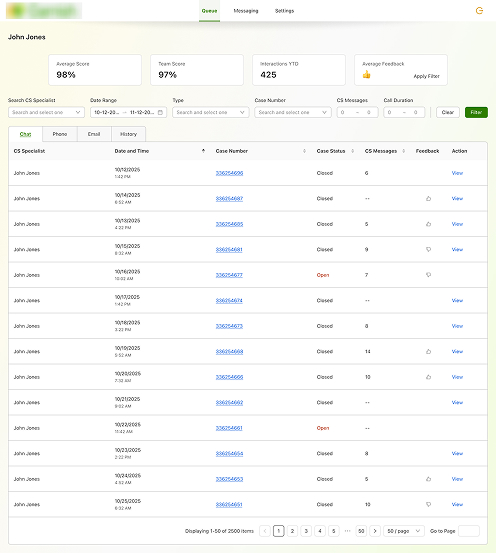
Upon logging in, a QA agent sees a filterable table of all completed customer service interactions for the current review period. The table is pre-loaded with the relevant date range and supports filtering by:
CS rep nameDate range (adjustable)
Interaction type — Chat, Phone, Email
Case number
Message count range
Call duration range
This replaced the manual process of cross-referencing Power BI tables across three separate interaction-type pages to find appropriately average-length examples. The filtering happens in one place, in seconds.
The table also displays a feedback status indicator per interaction — showing at a glance which reviews have been completed, which are in progress, and which haven't been started — replacing the Excel scheduling spreadsheet entirely.
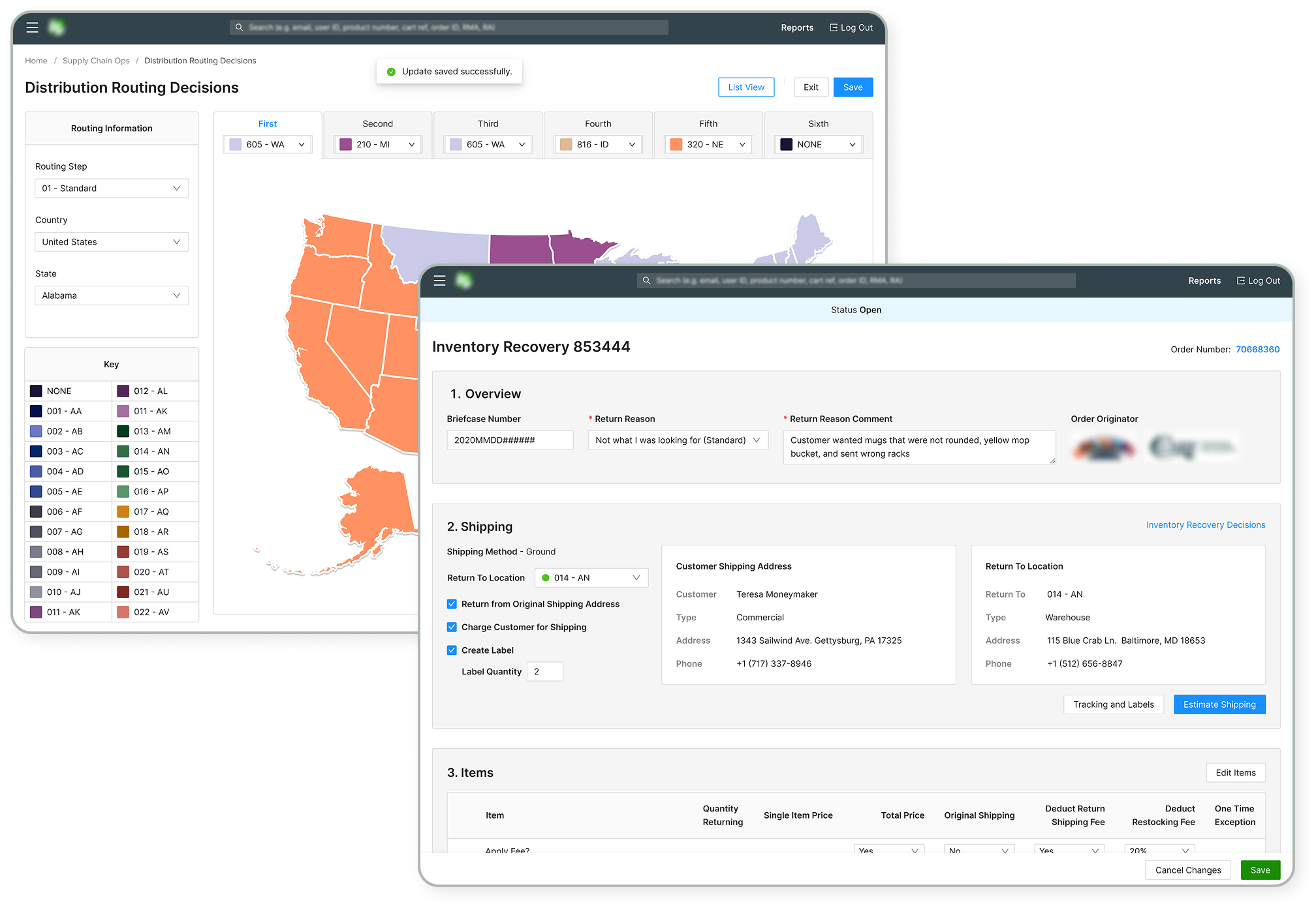
Anonymized IR Page in the "Review" phase showing the user entering a comment.
Anonymized IR Queue with the user sorting by order number.
The review interface
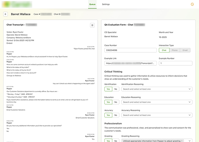
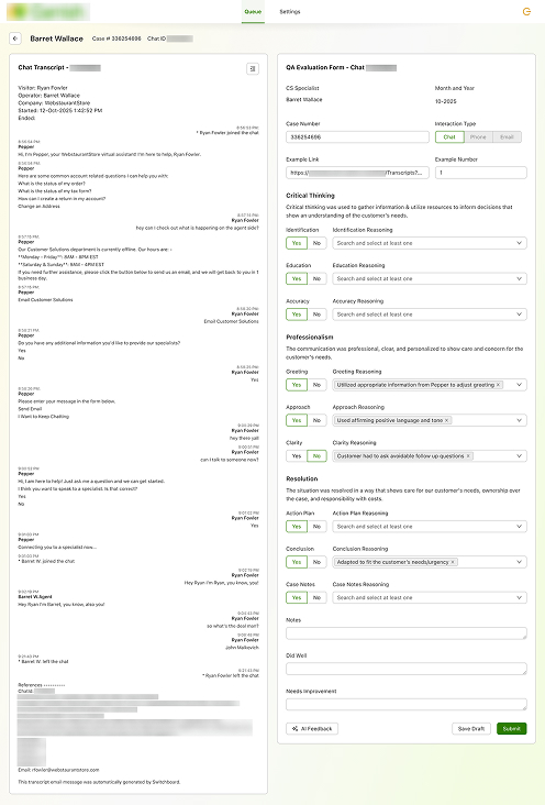
Clicking Review on any interaction opens a two-panel layout: the full interaction transcript on the left, the QA evaluation form on the right.The form opens pre-populated with identifying information pulled automatically — CS rep name, case number, date, interaction type — and with AI-suggested responses already filled into the relevant evaluation fields. The AI is trained to assess specific performance criteria across categories including Critical Thinking, Professionalism, and Resolution, suggesting Yes/No responses and pre-selecting dropdown reasoning options based on its reading of the transcript.

The QA agent's job shifts from filling out a form from scratch to reviewing and confirming what the AI has already assessed — correcting where it's wrong, confirming where it's right, and adding qualitative notes at the end.

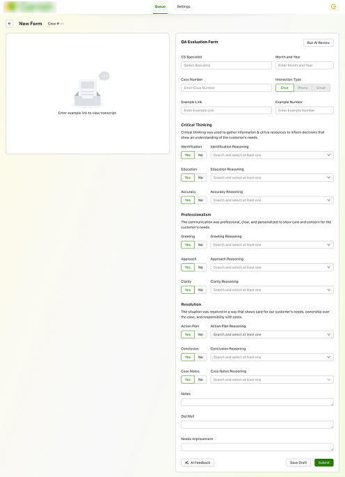
New form for other interaction typesFor phone calls and emails not yet covered by the AI pipeline in V1, agents can open a blank form from the main queue, manually enter the identifying information, and paste or link to the interaction example. Once linked, the transcript or reference populates the left panel in the same layout as chat reviews — maintaining a consistent experience across interaction types. Agents also have the option to manually trigger the AI review on these forms, running the same assessment pipeline on demand.[Visual: Annotated diagram or wireframe showing the manual trigger flow — if you have it]
One of the slides from the Warehouse Statistics Summary.
Redesigned routing decisions map.
AI feedback loopQA agents can flag AI assessments they disagree with using a dedicated feedback button, which opens a modal for them to explain what the AI got wrong. This was designed to feed back into model training over time — making the AI progressively more accurate for WebstaurantStore's specific QA rubric rather than remaining static.[Visual: Image 1 — the AI Feedback modal. Keep annotation minimal — the design speaks for itself here]
Design Decisions Worth Calling Out
Two-panel layout as the core UX decision. The most important thing Garnish does is keep the transcript and the evaluation form visible simultaneously. In the old process, agents had to context-switch between applications constantly — reviewing an interaction in one window while filling out a form in another. The two-panel layout eliminates that entirely. The agent never loses their place in the transcript while filling out the form.

AI as an assistant, not an authority. Every AI-suggested field is editable and every assessment is visible with its reasoning pre-shown in the dropdown. The design is explicit that the AI is making a suggestion, not a decision. The feedback modal reinforces this — agents are expected to push back when the AI is wrong, and that feedback matters. This was an intentional framing choice to build trust with a QA team that was understandably skeptical about AI evaluating human performance.[Fill in: were there specific objections from the QA team or stakeholders about the AI involvement? That's a compelling design challenge if so.]

Filtering as research replacement.
The filter bar in the queue isn't just a convenience feature — it's directly replacing the most time-consuming part of the old process. Designing it to support message-count and call-duration ranges specifically was a direct response to how QA agents manually hunted for average-length interactions in Power BI. The filter does that work automatically.
What V2 Would Have Included
V1 covered chat reviews with AI assistance. V2 was to include emails from the internal case management system. V3 was to include the phone calls component...

That's all well and nice but the end vision I was working toward included:
• Full AI pipeline for phone call and email review
• Automated interaction selection based on statistical averages, removing the need for agents to manually identify representative examples
• Scheduling and assignment directly within, replacing the Excel spreadsheet entirely
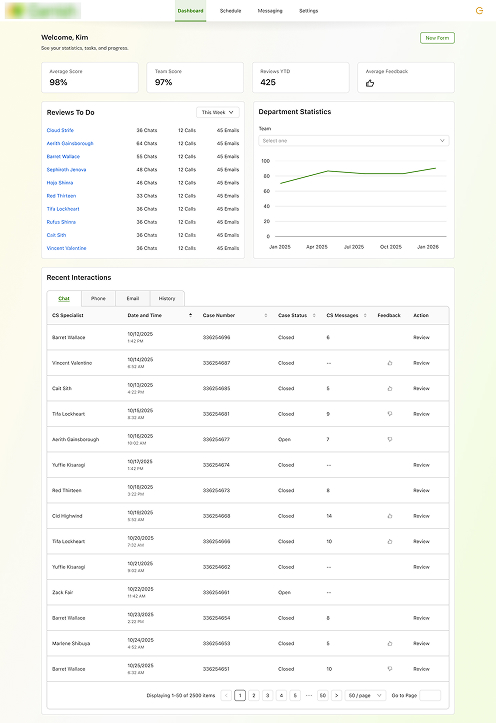
• Aggregate performance dashboards showing rep trends over time across review cycles
[Fill in: anything else you had wireframed or discussed for later versions?]
Results
Garnish was at v1 handoff stage when I left the company, so post-launch metrics aren't available. What I can speak to is the scale of the inefficiency it was designed to eliminate and the projected impact based on direct observation of the existing process.
60–75 minutes per review → ~15–20 minutes for chat reviews in V1, based on workflow comparison before and after
Projected 4–5x increase in review capacity — moving from monthly spot-checks toward genuine continuous performance monitoring
5 tools consolidated into 1 — Excel, Power BI, Power Apps, Briefcase, and a third-party call system replaced by a single environment
AI pre-population of evaluation fields eliminating the most repetitive data-entry work from every review
Feedback loop built in from day one — the system gets more accurate over time rather than remaining static
$1 million
estimated value recouped monthly after redesign.
6 - 8 hours
saved on average per employee per week across the returns team.
5 tools → 1
cohesive system to keep everything in one place.
WCAG AA
accessible color palette for use across all internal tools and warehouses
Accountability
for every step of the returns process eliminating the blame game for mistakes
What I learned
Garnish taught me that trust is a design problem.

The QA team wasn't resistant to a better tool — they were skeptical of an AI making judgments about their colleagues. That skepticism was reasonable and I had to design around it rather than dismiss it. Every decision about how the AI's suggestions were displayed, labeled, and overridable was a decision about whether the system felt like a collaborator or an authority. Getting that framing right mattered as much as the information architecture.

It also reinforced something I'd learned on the Returns project: the most important design work happens before any screens are made. The hours I spent watching the QA team navigate their existing process — understanding not just what they did but why the workarounds existed — were what made it possible to design something that replaced the right things and kept the things that were actually working.

If I'd been able to see Garnish through to launch and into the hands of the QA team, I think the feedback loop feature would have been the most interesting thing to study. Systems that learn from their users in real time are still relatively new in internal tooling, and watching that dynamic play out with a skeptical team would have been genuinely valuable.

[Visual: Simple illustration in your site's visual style — something that captures the AI-as-collaborator idea. Could be as simple as a human and a system working in parallel rather than one directing the other. Keep it consistent with whatever you made for the Returns What I Learned section]